Credits
Director / Designer : Mayu Kobayashi
Technical Director / Programmer : Kensuke Arakawa
Project Manager : Ikumi Tabata
Producer : Takuya Inagaki
Equipment / Backend Programming : Hibino Spacetech Corporation
Shooting : CAP
Technical Director / Programmer : Kensuke Arakawa
Project Manager : Ikumi Tabata
Producer : Takuya Inagaki
Equipment / Backend Programming : Hibino Spacetech Corporation
Shooting : CAP
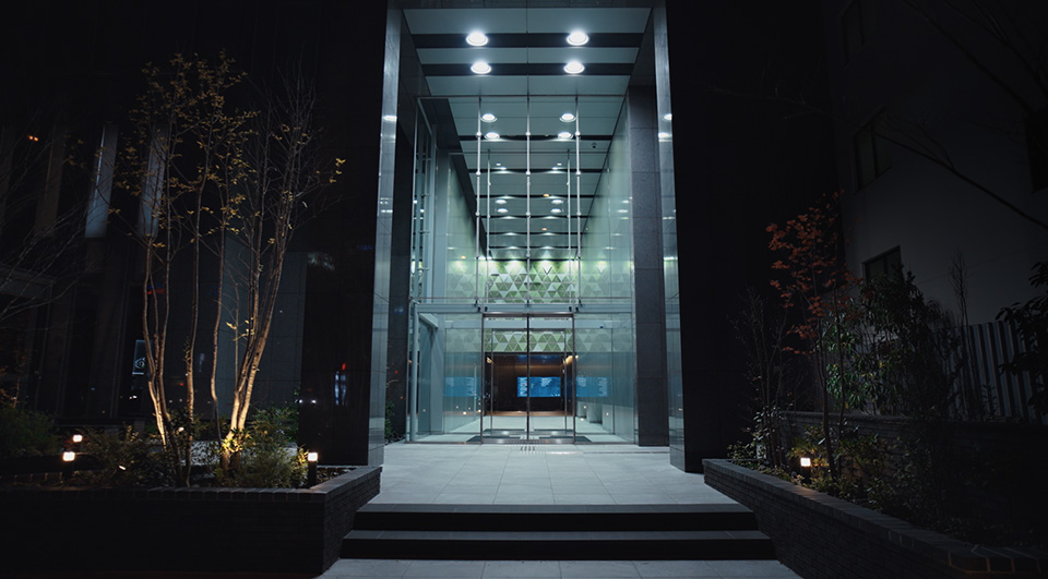
Ichigo Kakyoin Building Digital Signage
Ichigo Estate|2024
Project Description
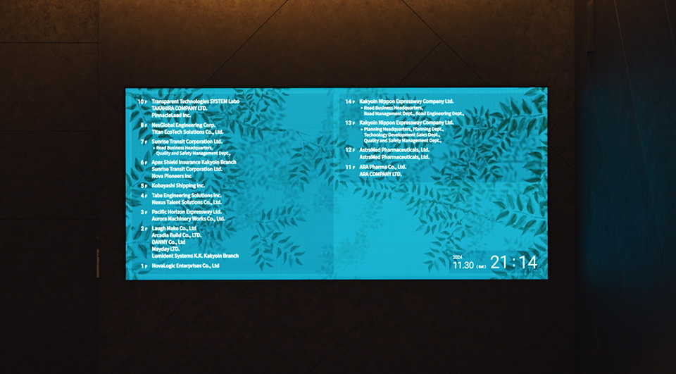
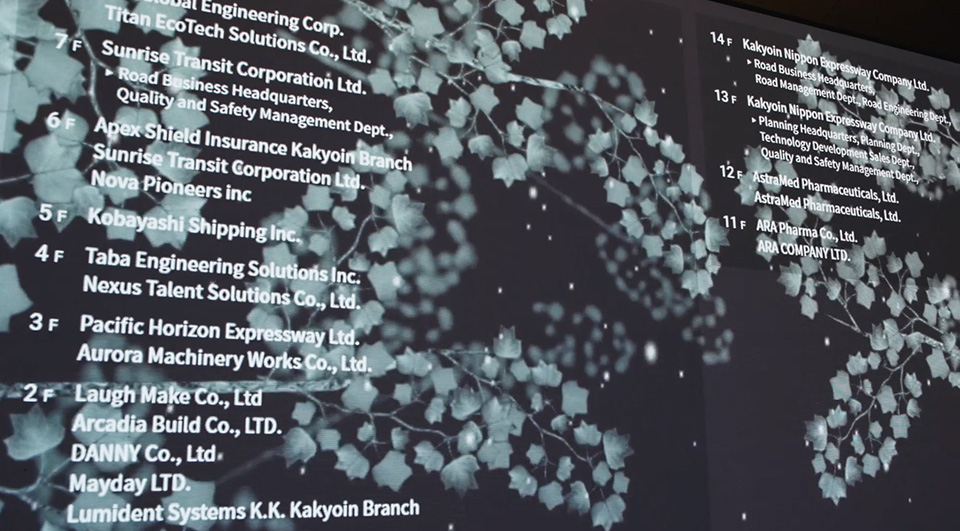
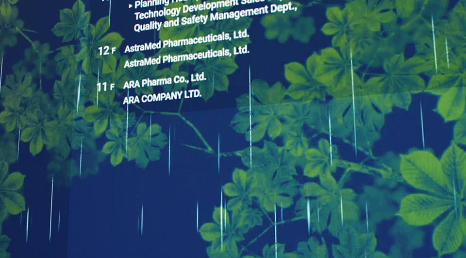
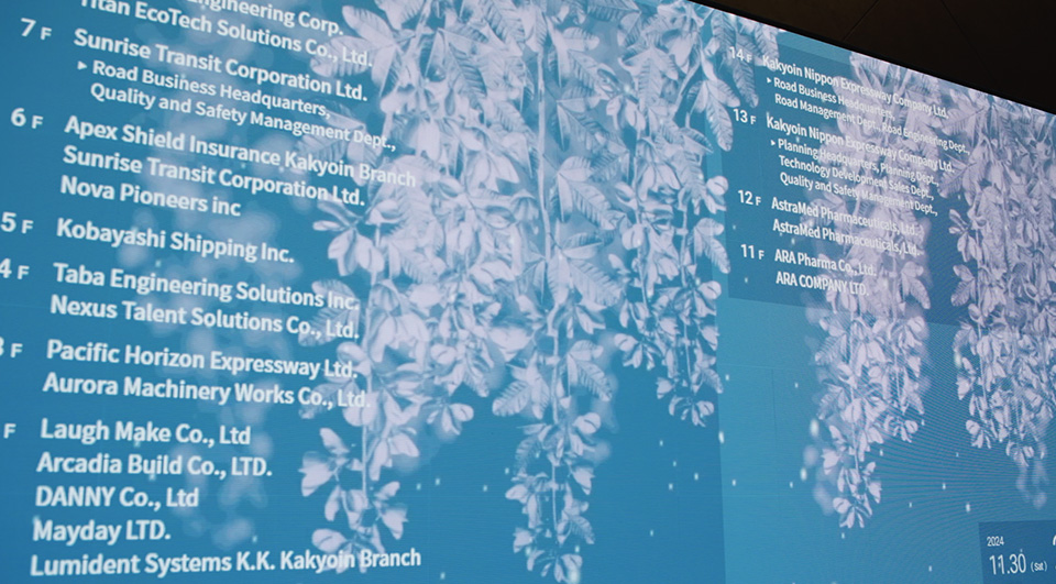
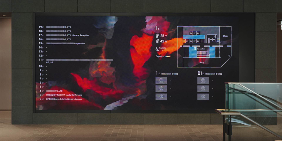
Ichigo Estate has installed new digital signage at the entrance to its Ichigo Kakyoin Building, where the company's office is based, following major renovation work to the building. WOW assumed responsibility for the planning, production, and systems development of the signage, which has replaced the previous signage which indicated the building's tenants. The signage has been designed around the theme of Ichigo Ichie, literally meaning “One lifetime, one encounter,” and functions to provide guests with a warm and comfortable welcome while also providing information regarding the building's tenants. Furthermore, the use of an image generation system and the incorporation of real-time information functionality provides workers in the building with a dynamic and ever-changing visual experience daily.
Design Theme
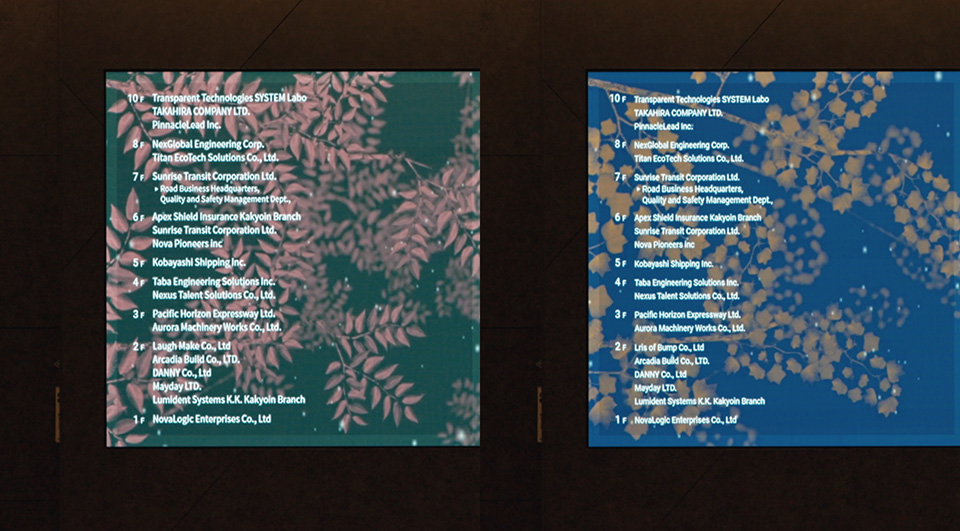
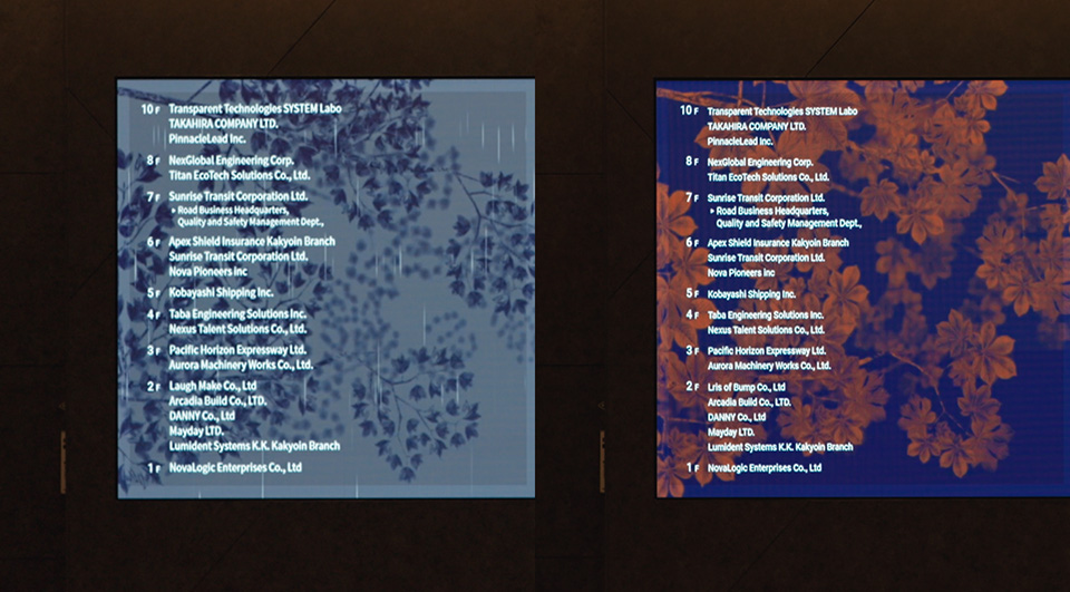
The signage was designed around a combination of the following three themes: “Plant life,” “Change,” and “Art.” The plant life, which is depicted in silhouette using simple colors, changes subtly in appearance in response to changes in the weather and time of day, resulting in a finished piece that resembles an artwork.
Plant Life
The plant life is based on the following five motifs: “Keyaki,” the Japanese name for the zelkova tree, a tree that is symbolic of the city of Sendai (Miyagi Prefecture); “Hagi,” the Japanese name for the bush clover, a flower that is also symbolic of the city of Sendai; “Tochinoki,” the Japanese name for the horse chestnut tree; “Yurinoki,” the Japanese name for the tulip tree; and “Toukaede,” the Japanese name for the trident maple tree. As the signage will be installed at the end of the building's lush and green approach, the plant life was drawn to be in harmony with the surrounding space.
Change
The fives types of plants are depicted in colors randomly selected from a preset color palette and will animate in such a way that reflects the weather of that particular day (Clear/Rainy/Windy/Snowy), creating unique visuals each and every day. The volume and color tones of the plant life will also change as time passes throughout the day. These changes will be made to coincide with the times of day in which there is the highest footfall, such as during commuting hours, ensuring the transitions more easily catch the attention of those passing by.
Art
The plant life and the background are displayed in two distinct colors. The plant life is depicted in silhouette, allowing for the unique characteristics of the leaves and branches to be truly appreciated. The color palette used for the plant life is based on the motif of flora and the natural environment, invoking the four seasons, while the background uses a design motif of the changing sky across the months of the year. Although the images are in video format, the visuals employ a water-color effect, evoking the feeling of one admiring a painting.
Ichigo Estate has installed new digital signage at the entrance to its Ichigo Kakyoin Building, where the company's office is based, following major renovation work to the building. WOW assumed responsibility for the planning, production, and systems development of the signage, which has replaced the previous signage which indicated the building's tenants. The signage has been designed around the theme of Ichigo Ichie, literally meaning “One lifetime, one encounter,” and functions to provide guests with a warm and comfortable welcome while also providing information regarding the building's tenants. Furthermore, the use of an image generation system and the incorporation of real-time information functionality provides workers in the building with a dynamic and ever-changing visual experience daily.
Design Theme
The signage was designed around a combination of the following three themes: “Plant life,” “Change,” and “Art.” The plant life, which is depicted in silhouette using simple colors, changes subtly in appearance in response to changes in the weather and time of day, resulting in a finished piece that resembles an artwork.
Plant Life
The plant life is based on the following five motifs: “Keyaki,” the Japanese name for the zelkova tree, a tree that is symbolic of the city of Sendai (Miyagi Prefecture); “Hagi,” the Japanese name for the bush clover, a flower that is also symbolic of the city of Sendai; “Tochinoki,” the Japanese name for the horse chestnut tree; “Yurinoki,” the Japanese name for the tulip tree; and “Toukaede,” the Japanese name for the trident maple tree. As the signage will be installed at the end of the building's lush and green approach, the plant life was drawn to be in harmony with the surrounding space.
Change
The fives types of plants are depicted in colors randomly selected from a preset color palette and will animate in such a way that reflects the weather of that particular day (Clear/Rainy/Windy/Snowy), creating unique visuals each and every day. The volume and color tones of the plant life will also change as time passes throughout the day. These changes will be made to coincide with the times of day in which there is the highest footfall, such as during commuting hours, ensuring the transitions more easily catch the attention of those passing by.
Art
The plant life and the background are displayed in two distinct colors. The plant life is depicted in silhouette, allowing for the unique characteristics of the leaves and branches to be truly appreciated. The color palette used for the plant life is based on the motif of flora and the natural environment, invoking the four seasons, while the background uses a design motif of the changing sky across the months of the year. Although the images are in video format, the visuals employ a water-color effect, evoking the feeling of one admiring a painting.

Credits
Director / Designer : Mayu Kobayashi
Technical Director / Programmer : Kensuke Arakawa
Project Manager : Ikumi Tabata
Producer : Takuya Inagaki
Equipment / Backend Programming : Hibino Spacetech Corporation
Shooting : CAP
Technical Director / Programmer : Kensuke Arakawa
Project Manager : Ikumi Tabata
Producer : Takuya Inagaki
Equipment / Backend Programming : Hibino Spacetech Corporation
Shooting : CAP
Related


- All
- Featured
- Commercial
- Motion Graphics
- Installation
- Prototype
- Product
- UI/UX
Works


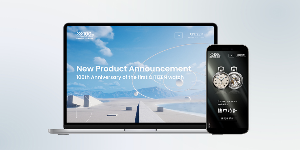
CITIZEN 2024 New Product Announcement 100th Anniversary of the first CITIZEN watch / Official website
CITIZEN|2024


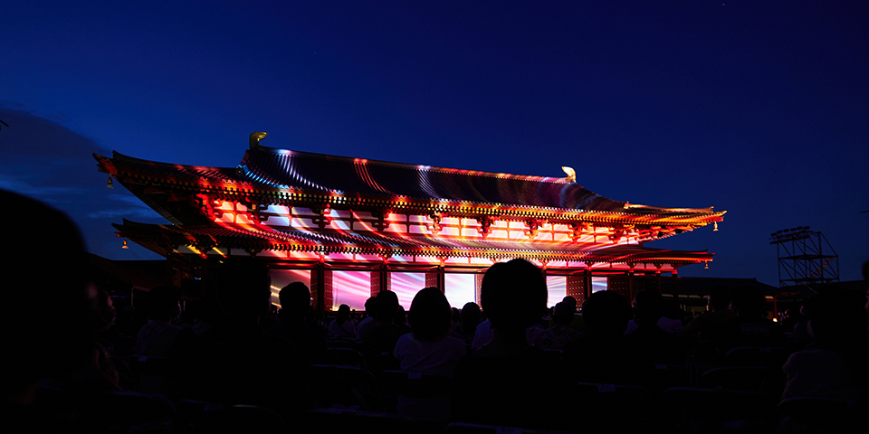


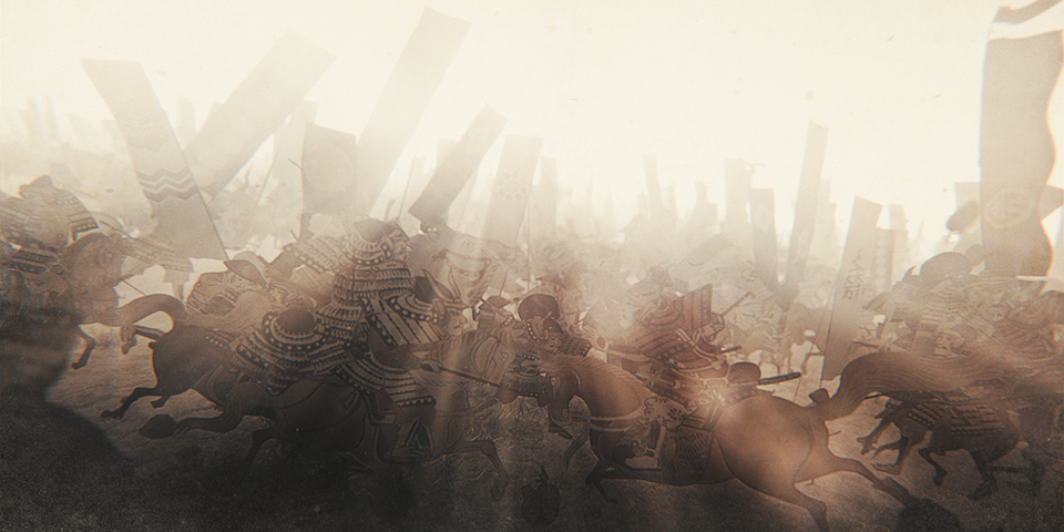
The Battle of Sekigahara 3D Motion Graphic Display
HITOHATA / Tourism Agency / Okazaki City / Sekigahara Town / Gifu Prefecture