Credits
Director : Takuma Nakazi
Conceptor : Yuki Tazaki
Technical Director : Shunsaku Ishinabe, Kensuke Arakawa
UI Designer : Saki Kato, Haruka Kanno
Designer : Daisuke Moriwaki
Programmer : Seiya Takasawa
Producer : Shinichi Saeki
Frontend programming : nadia, Inc
Backend programming : TECHNO SUPPORT COMPANY
Conceptor : Yuki Tazaki
Technical Director : Shunsaku Ishinabe, Kensuke Arakawa
UI Designer : Saki Kato, Haruka Kanno
Designer : Daisuke Moriwaki
Programmer : Seiya Takasawa
Producer : Shinichi Saeki
Frontend programming : nadia, Inc
Backend programming : TECHNO SUPPORT COMPANY
URBANNET NAGOYA nexta BUILDING Digital Signage
WOW was tasked with the planning, production, and system development of all the next generation Urbannet Nagoya Nexta Building's digital signage. As the first of the next generation office buildings, Urbannet Nagoya Nexta Building is an environmentally friendly building that not only supports flexible work styles by utilizing NTT Group's digital infrastructure, Machizukuri DTC®, but also uses renewable energy as the source of all its electricity. It is positioned as the first step in taking on the challenge of building cities of the future.
Systems
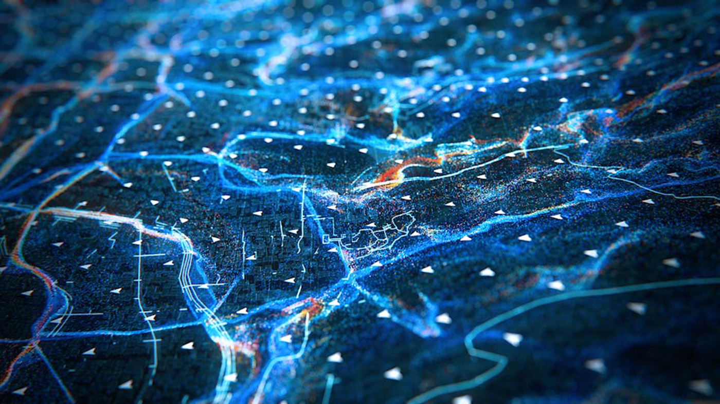
The ICT technology embedded in the building converts "sensing data" into “experience value” that is close to an environment where people can be relaxed and feel at ease, and are reflected in the active facade to create an Artifical Environment (AE).
Visual Design
This work uses images reconstructed in the brain, as the shadows and afterimages that remain after the colors blend and disappear make you think “I've seen this somewhere before.” This was given the name Impression Scenery.
There is an impressionist painting technique called color division (brushstroke division), which refers to the technique of placing paint directly on the canvas to avoid mixing the paint and making it darker. In this work, this technique is utilized to create a rougher touch rather than a photo realistic one. The theory of visual mixing is an important characteristics of Impressionism, which states that “mixing takes place on the retina, not on the palette.”
Impression Scenery is designed to create a continuous flow of new scenery by mixing various colors, as if in response to the active facade that creates connections and flows, losing the architectures characteristic space boundaries.
Additionally, we focused on minimizing the amount of signage information, softening the oppressiveness of visual information as much as possible, and designing the building to blend in with the architectural concept and space. While providing visitors with the necessary information, it also offers an organic and creative space created by a landscape of colors.
Signage design concept — FIT
The following concepts were established for the interface design that provides detailed information about the building.
・FIT People
A design that displays the appropriate information. A layout that displays the information simply.
・FIT The Building
An appearance that doesn't seem too digital, using visual effects to make sure the scenery isn't ruined.
・FIT Signs
A tone that matches the signage. A clear layout so information is easy to see.
・FIT Practicality
A grid system is used for easy repairs if required.
Credits
Director : Takuma Nakazi
Conceptor : Yuki Tazaki
Technical Director : Shunsaku Ishinabe, Kensuke Arakawa
UI Designer : Saki Kato, Haruka Kanno
Designer : Daisuke Moriwaki
Programmer : Seiya Takasawa
Producer : Shinichi Saeki
Frontend programming : nadia, Inc
Backend programming : TECHNO SUPPORT COMPANY
Conceptor : Yuki Tazaki
Technical Director : Shunsaku Ishinabe, Kensuke Arakawa
UI Designer : Saki Kato, Haruka Kanno
Designer : Daisuke Moriwaki
Programmer : Seiya Takasawa
Producer : Shinichi Saeki
Frontend programming : nadia, Inc
Backend programming : TECHNO SUPPORT COMPANY
Related
- All
- Featured
- Commercial
- Motion Graphics
- Installation
- Prototype
- Product
- UI/UX
Works
CITIZEN 2024 New Product Announcement 100th Anniversary of the first CITIZEN watch / Official website
CITIZEN|2024
The Battle of Sekigahara 3D Motion Graphic Display
HITOHATA / Tourism Agency / Okazaki City / Sekigahara Town / Gifu Prefecture