SHISEIDO GLOBAL FLAGSHIP STORE Vol.2 | Contents
Case Study
BRIEF
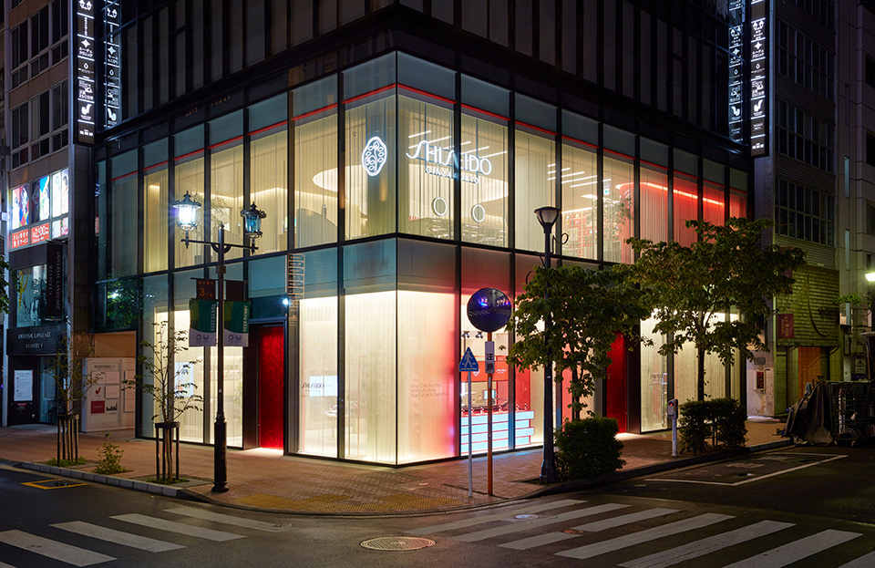
The SHISEIDO GLOBAL FLAGSHIP STORE is now open. Here at the SHISEIDO GLOBAL FLAGSHIP STORE, you will see the digital contents with the latest technology. WOW was in charge of the planning, direction and production of the flagship store’s in-store contents, symbols, and PR tools.
PROCESS
Since store fixture location and enclosure design are closely associated with UX, WOW has been working with companies on co-creation from interior design to store fixture design and backend development since 2018.
RESULT
By creating digital experiences through in-store content, positioning the brand with installations, and producing PR tools, WOW made a significant contribution to the new customer experience that the flagship store was going for.
Overview
SHISEIDO, already operating in 88 countries and regions around the world, saw the grand opening of its SHISEIDO GLOBAL FLAGSHIP STORE in Ginza, where the company has been initially founded. The flagship store occupies three floors of the building, making it the largest branch that the brand operates.
Here at the SHISEIDO GLOBAL FLAGSHIP STORE, with all its partnering businesses gathering, you will see digital contents that you won't be able to find anywhere else. WOW spent time and had a discussion with SHISEIDO and its partnering businesses, allowing our collaboration to proceed smoothly. WOW applied SHISEIDO’s positioning ideas to the store’s UI/UX design, installation, and PR tools to create an integrated design and user experience.
This page explains the UI/UX production process, design intent, and other aspects of the first and second floors’ content. Information about the overall UI design concept, the UI design concept for each floor, the water feature installation that is the symbol of SHISEIDO’s flagship store, and the PR tools can be found in Vol.1.
1F | Play with Beauty – The Five Contents
Customers can try all the experience contents on the first floor to explore what they like and choose what they want. WOW was in charge of the UI design for the five experiential contents set up on the first floor. This floor runs on self-service with no Beauty Consultants. As such, we were faced with the challenges of helping the customers gain content experience and conveying product information. We wanted the floor to be a place where people run into items that they were not previously aware of.
1 | POWER BAR
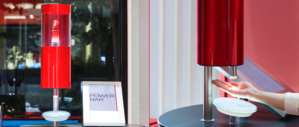
Hold your hand below the nozzle to receive an ejection of ULTIMUNE. We had a discussion with the store fixture designer regarding the actions of the fixture to accompany the content experience. Based on the discussion, we then improved the interface so that customers can receive an ejection of the essence by simply placing their hands below the nozzle.
Improvements (this is a non-exhaustive list)
- Instructional video played during standby
- Sign of hand placed below nozzle tray
- The LED embedded in the sign of hand is meant to guide customers to where they are supposed to place their hands
- When the customer’s hand is detected by the sensor, the tip of the nozzle will light up with a sound effect. The light is intended to inform the customer that his/ her movement has been correctly detected by the sensor
The device’s feedbacks have been finely adjusted to match the user’s operation. The content is simple in that the customer just needs to hold his or her hand below the nozzle to receive an ejection of the essence. However, given that the device can fail to function ideally depending on when the light lights up or when the screen displays information earlier than scheduled to, the interaction between the device and the UI has been fine-tuned on a second-by-second basis.
2 | FOUNDATION BAR
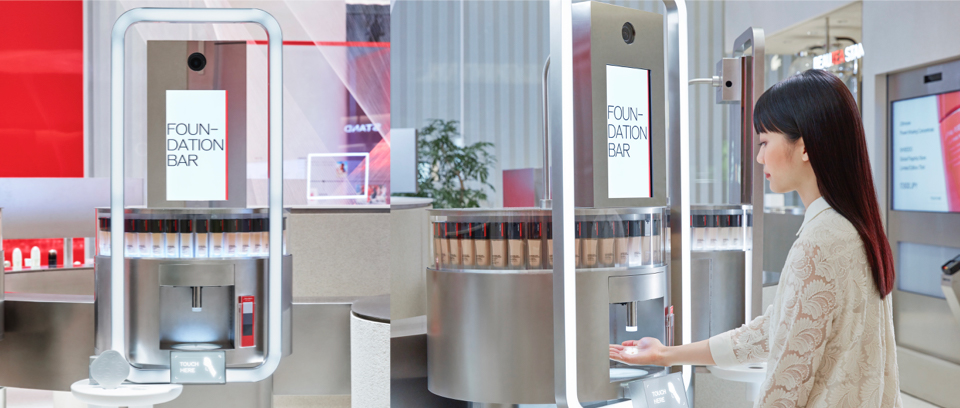
With a photograph that the customer takes, the system can select three colors that best match the customer’s skin tone from among 30 foundation colors. This digital tester allows customers to find out what is best for themselves - right there on the spot. All the user has to do is follow the instructions on the screen to take a picture of their face. Three different colors that match the user’s skin will be selected through photo analysis.
Content Background
We have installed a set of fixtures and displays with 30 colored product bottles arranged in a ring shape for this particular content. The fixture’s prototype only had product information shown on the screen, leaving people with a strong mechanical impression and failing to match the products shown on the screen in terms of image. Based on this observation and the ensuing conversation between WOW and SHISEIDO, products at this flagship store were placed in both the POWER BAR and FOUNDATION BAR, and the fixtures were linked to the displays.
Functions
- The selected three colors are displayed on the display. At the same time, the LED light emits on the corresponding three products on the fixture, bringing them into the customer's focus.
- When the customer selects one color on the display, the fixture will turn around to bring the selected product to a stop in front of the customer.
- We have developed a system that can be used in conjunction with the display, fixtures, and product movement to create an impression of the product being tested.
- When the three selected colors are being compared, the background color of the product on the display is filled in with the foundation color to show the slight difference in color, and its display is enlarged to enhance visibility.
By linking products, fixtures, and displays, we have streamlined the entire process, from guiding the customer to experience the content to helping the customer experience the tester.
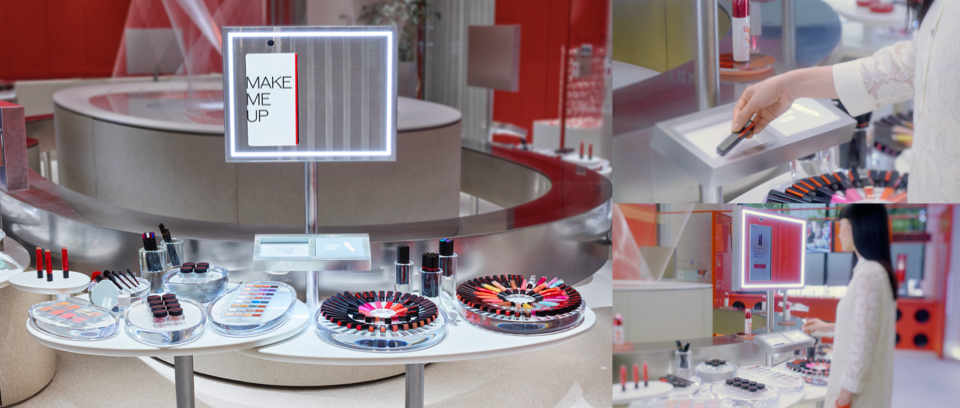
3 | MAKE ME UP
The customer can use the simulator function to check the finished image of the makeup on his/ her face. The content helps the customer find products that match them and their preferences among all the products that the flagship store has available.
Objectives
- Bringing products to customers’ attention
- Encouraging customers to use testers
Functions
- Simply place products on the tray, and the screen will start displaying their information
- With the touch of a button, the customer can see a simulated image of their face with makeup applied.
When the content was still under development, WOW and SHISEIDO had a discussion about what to focus on - having customers experience the simulator or having customers casually try out SHISEIDO's products. Through the discussion, WOW and SHISEIDO both agreed that it would be more important to have the customers use the testers and simulators. WOW then designed the UX based on this agreement.
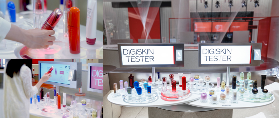
4 | DIGISKIN TESTER
There are two ways to find the product you want; based on intuition(①), based on what their skin needs at the moment (②). DIGISKIN TESTER has incorporated both these ways of product-hunting to help customers find what they need.
Objectives
① Providing information for products selected intuitively
② Introducing products selected based on skin needs
Functions
① When the customer selects a product from the platform, the sensor will react, and the product description will be shown on the screen.
② Based on the customer's questionnaire result, the LED lights will cast light on recommended products.
Store Fixture Features
- The table is big enough to allow two people to experience using the device at the same time
- To avoid confusion when two users operate the device at the same time, the screen will display in the following way:
・ The interface will be displayed with two different colors
for user differentiation
・ When the LED lights are cast on recommended products,
the lights cast will match the users’ respective colors
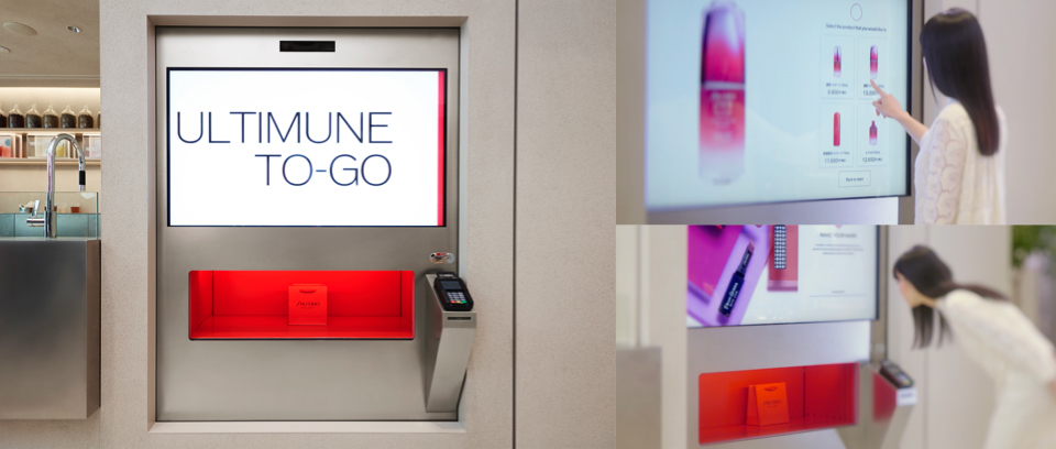
5 | ULTIMUNE TO-GO
This is a vending machine that sells only ULTIMUNE, a beauty essence that is a SHISEIDO best seller with many loyal users. You can purchase ULTIMUNE without having to line up at the cashier.
Fixtures
- Standby video shows ULTIMUNE on the big screen.
- Looking at the screen, customers will feel as if they are looking at the actual product display.
- The visible range of the display will reduce as the user approaches the screen. We designed the buttons and other interfaces to be compact and within easy reach while integrating important information into the customer’s field of view and considering ease of operation.
- The right half of the screen is the interface for purchasing, and the left half is the screen for projecting ULTIMUNE product images and service images to the customer.
- When the customer finishes paying, the product exit will light up, after which the product purchase will be dispensed.
Shopping has been made quick and easy, with satisfaction still guaranteed.
2F | Create Your Own Beauty - The Three Contents
On this floor, customers can receive counseling and customized services from SHISEIDO’s Beauty Consultants. This is where you can discover your own unique beauty with the help of SHISEIDO’s professionals based on the results of your experience and lifestyle diagnosis on the first floor. WOW was in charge of designing the UI for the counseling tablets and the UI design for the imprinting service. This is where you discover beauty like you never have through conversations with SHISEIDO’s Beauty Consultants.
1| SKINCARE LESSON
Counseling service with a tablet. In addition to the traditional counseling by SHISEIDO’s Beauty Consultants, they also provide lifestyle suggestions.
2 | MAKEUP LESSON
Counseling service with a tablet. SHISEIDO’s Beauty Consultants will show you how beautiful you can be with what best matches you.
Together with Skincare Lesson and Make-up lesson, we created a UI to manage the customer’s questionnaire to facilitate the ensuing interview process. The screen structure, including question items and page transition icons, is designed to make it easy for Beauty Consultants to proceed with the operation during a conversation. SKINCARE LESSON automatically derives the style that best matches the customer on the spot based on SHISEIDO’s aesthetic theories and provides suggestions. With MAKEUP LESSON, the customer’s requests are recorded on the tablet. The customer can later go back home with the recorded video, so even at home she will be able to do the makeup himself/herself.
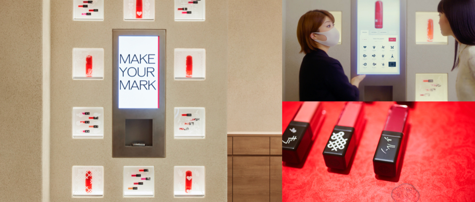
3 | MAKE YOUR MARK
This service allows the customer to customize their product by engraving their own message or illustration on them.
[SHISEIDO's Objectives]
- To encourage purchase based on the uniqueness of end products
[Functions]
SHISEIDO’s Beauty Consultants are in control of this content. As such, the instructions for the UI of this content are kept to a minimum. To compensate for this, a large graphics area is reserved to communicate the appeal of the engraved graphics.
WOW created the UI for the editing screen, which has a series of graphics and texts that can be used for engraving. By selecting a design on the screen, the customer will be able to see what his/ her product will look like with the design engraved on it. With this content, the customer will also be able to go through as many rounds of trial and error as they like until they feel satisfied.
Staff List
1F / 2F Contents
Producer: Go Hagiwara
UI/UX Designer:Sayaka Maruyama, Saki Kato, Takaaki Morita, Yutaka Kadota, Mayu Kobayashi, Reiko Katayama
Movie:Shigeru Makino, Misaki Horai
Programming:D1、TASKO、office FA
Body Design:DC International
Body Design /Programming:V-SYNC
Interior Design:NOMURA Co., Ltd.
SE:Yusuke Tamaki
Store System Design / Implementation:NRI
Installation
Concept / Design / Program: Yuki Tazaki, Takuma Nakazi, Shunsaku Ishinabe, Daisuke Moriwaki
Lighting Design / Production:Tokyo Lighting Design
Water Landscape Design:Bellrx
Art Department: Gendai Koubou
Interior Design:NOMURA Co., Ltd.
Promotion Contents
Producer: Go Hagiwara
Director: Shigetaka Makabe
Motion Graphic Designer: Kazunori Kojima
Photographer: Toshimi Narikami
Gaffer: Yuichi Kato
DIT:Hiroyuki Watanabe
Casting: Kettle inc.
Stylist: Yoppy
Hair&Make-up: Rie Aoki
Retoucher: Kazuya Tomabechi
Editor: Sony PCL
Music:daji studio
Copy Writer: Atsushi Katayama
